Bath and Body Works Re-Brand
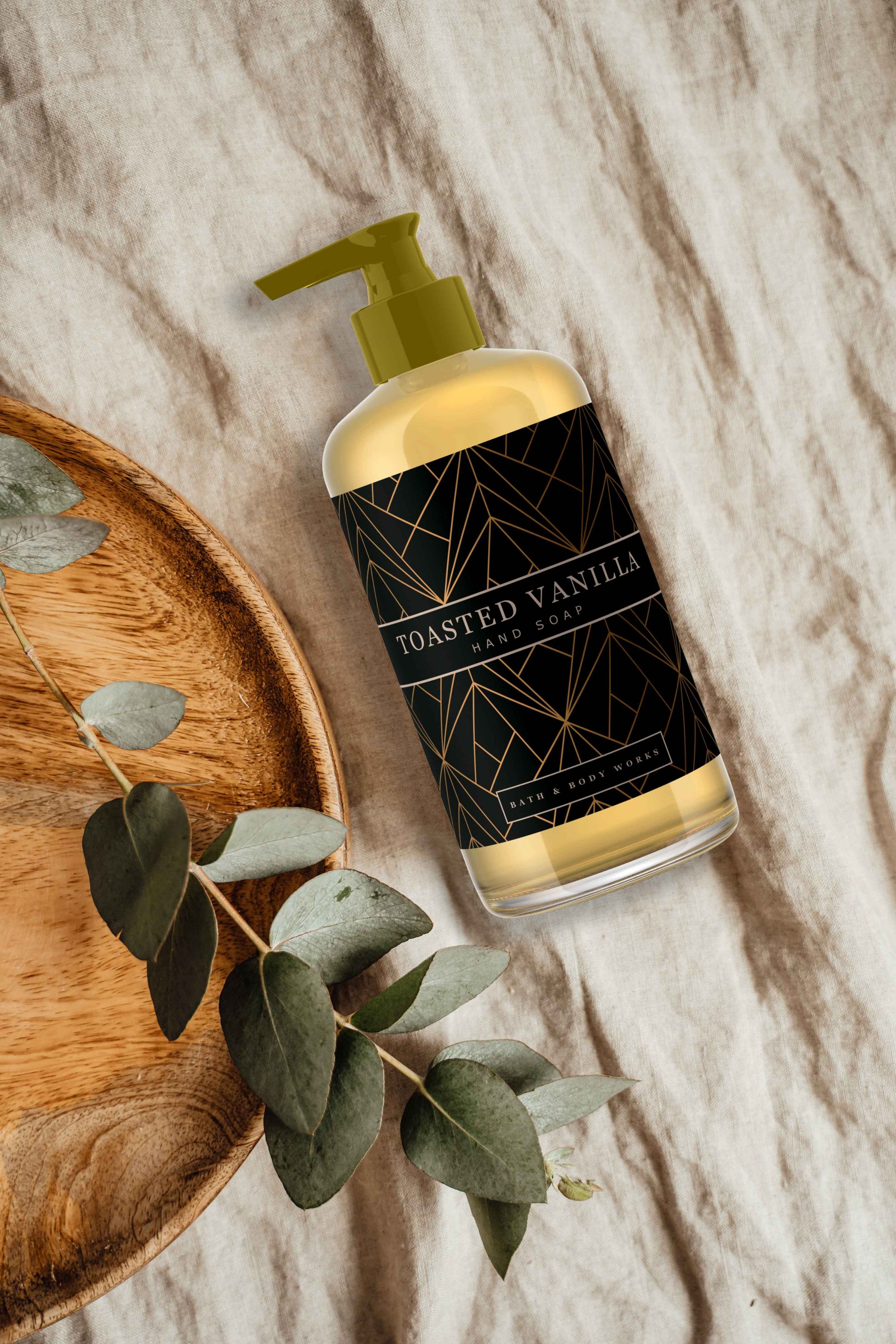
I redefined Bath & Body Works' visual identity to elevate its perception of quality and sophistication. The original branding evoked nostalgia but lacked the allure of a luxury experience. To shift consumer perception, I introduced a warm, refined color palette of greens, oranges, pinks, blues, and black—leveraging the power of color in purchasing decisions.
Incorporating geometric patterns and clear bottles with gold or black pumps further reinforced a sense of premium quality, aligning with consumer insights on the impact of packaging design. By crafting an elevated yet approachable brand aesthetic, I positioned Bath & Body Works as a strong contender in the premium market while preserving its core values of quality and affordability.


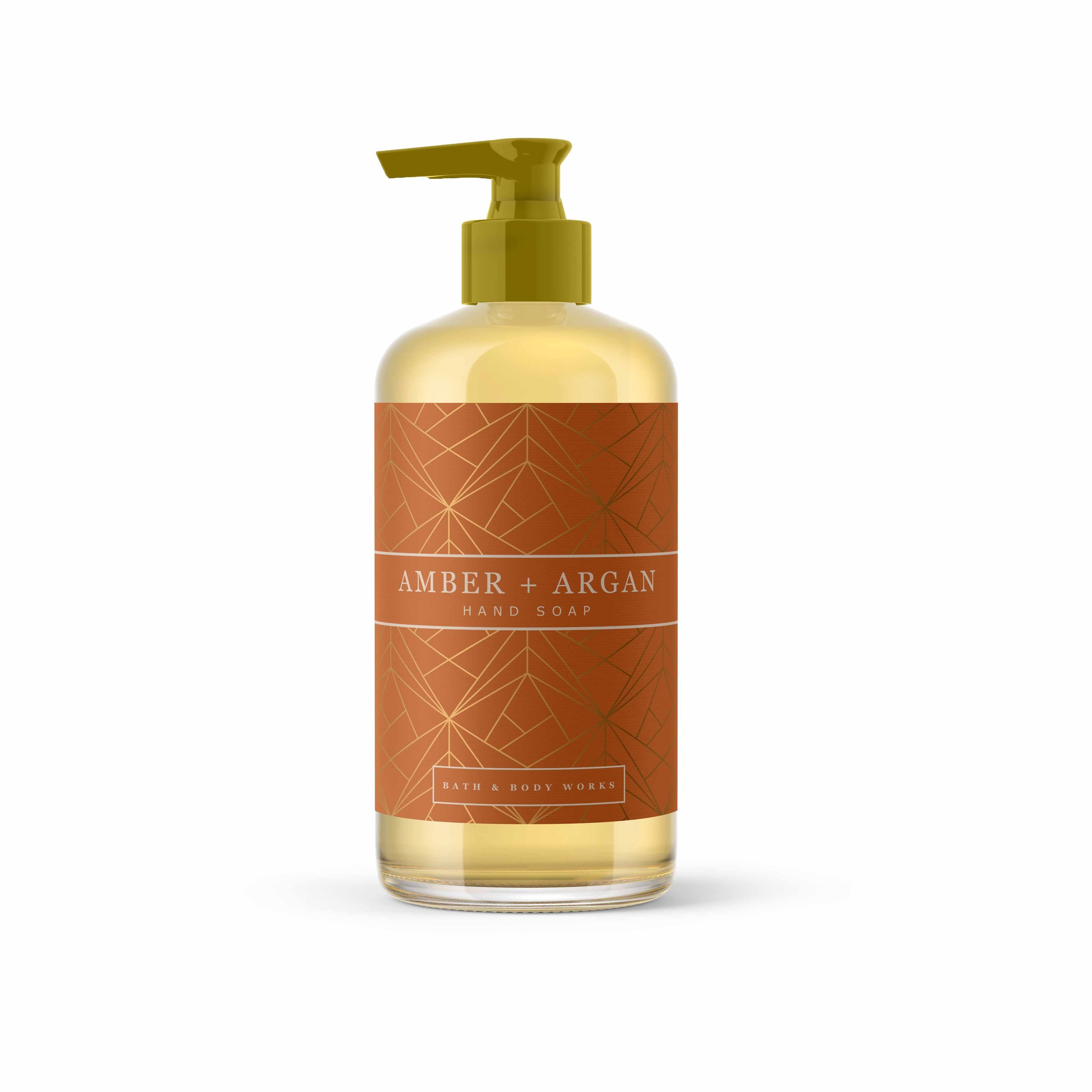
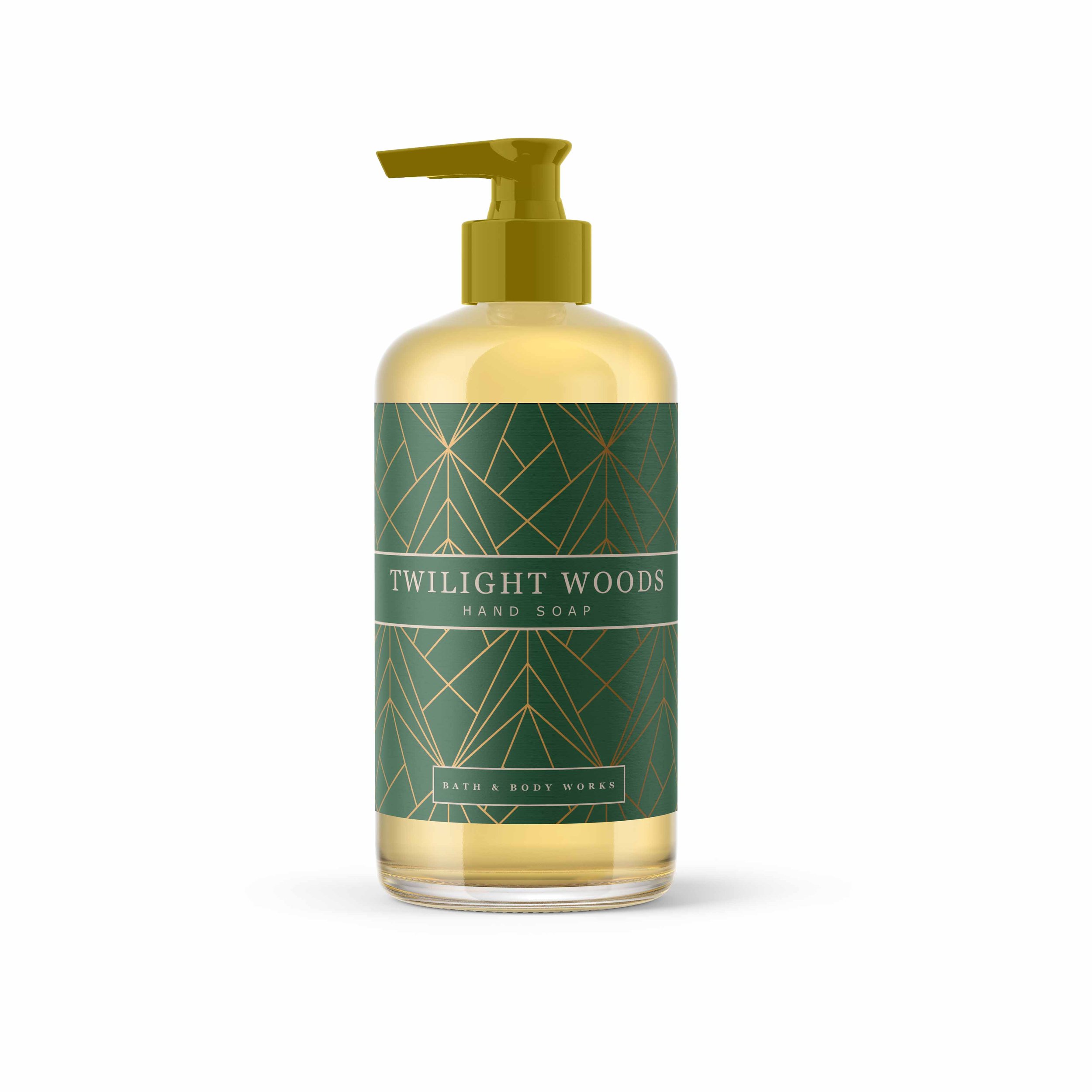
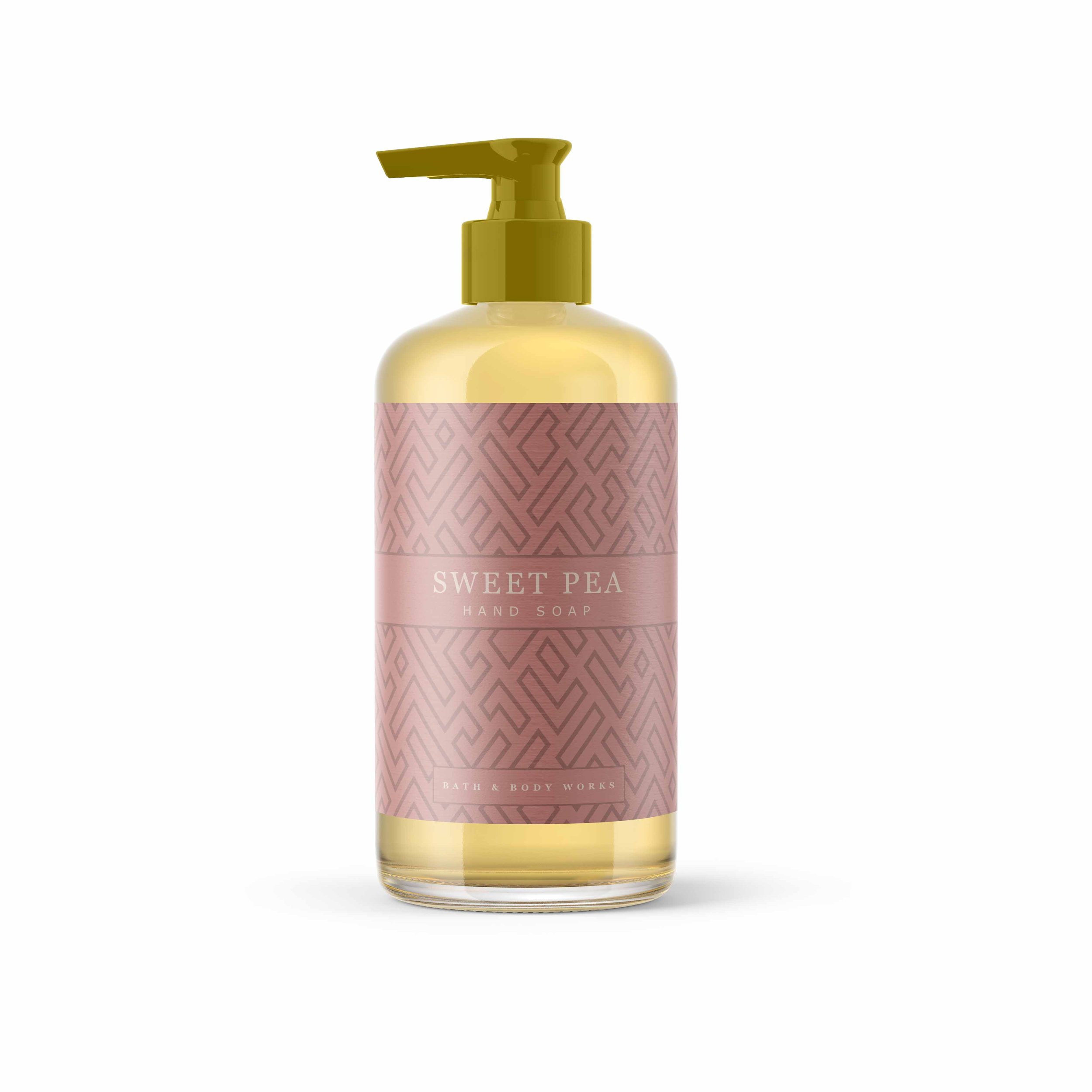
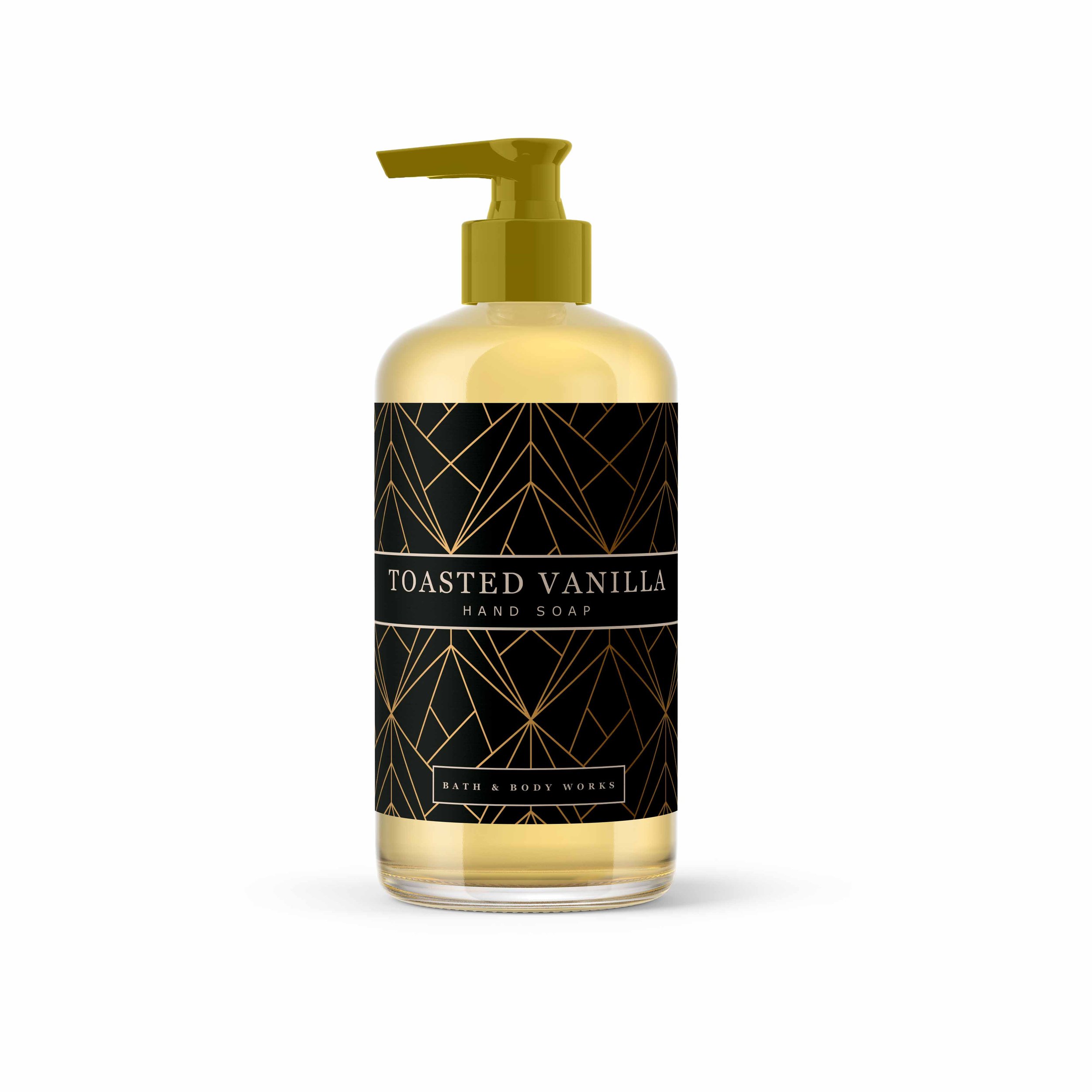

Since 85% of consumers make purchasing decisions based on color, I focused on crafting a carefully curated color palette for Bath & Body Works that would evoke emotion and draw customers in. By aligning the colors with the brand’s established identity while making them vibrant and inviting, the palette helped create an immersive shopping experience. This strategy not only captured the essence of the brand but also influenced purchasing behavior, making it easier for customers to connect with the products and enhancing their overall shopping experience.


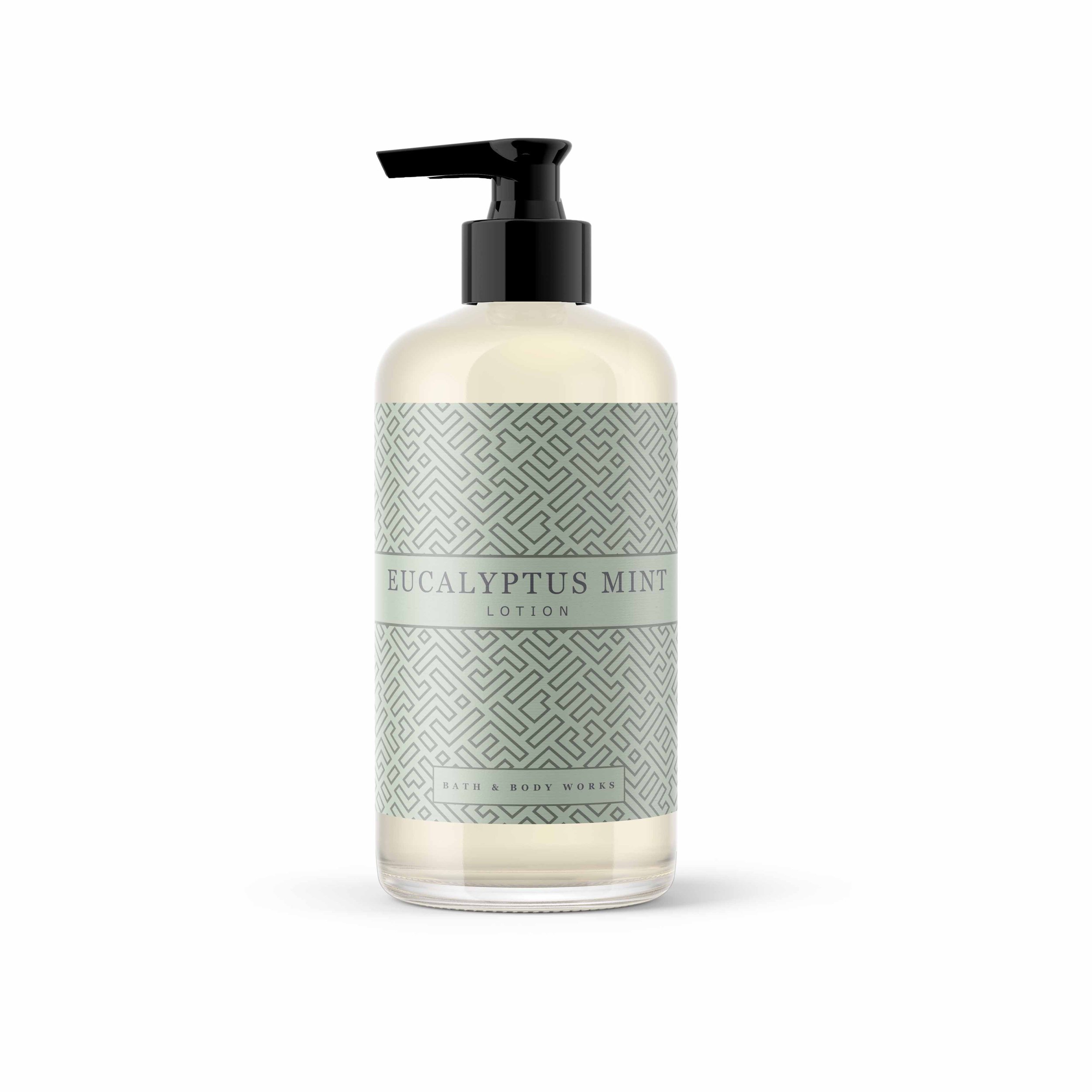


Recognizing that 72% of consumers are influenced by packaging design when making purchase decisions, I focused on creating visually compelling packaging that both reflected Bath & Body Works' brand identity and resonated with consumers’ desires for indulgence and luxury. The packaging was designed to be both functional and aesthetically pleasing, with bold, eye-catching elements that not only showcased the products but also encouraged customers to engage with the brand. This thoughtful design approach helped drive customer interest and fostered a stronger emotional connection with the products.
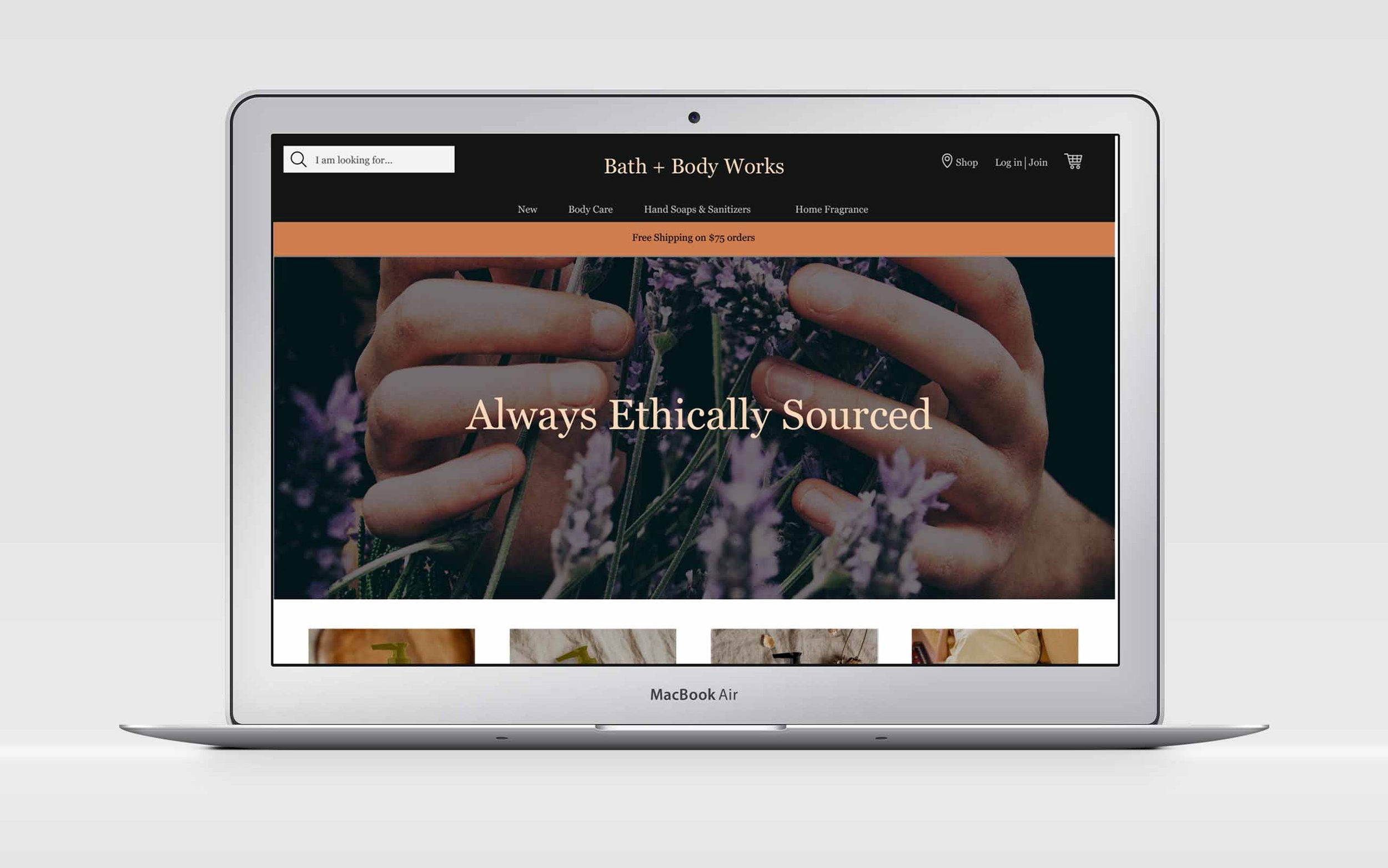
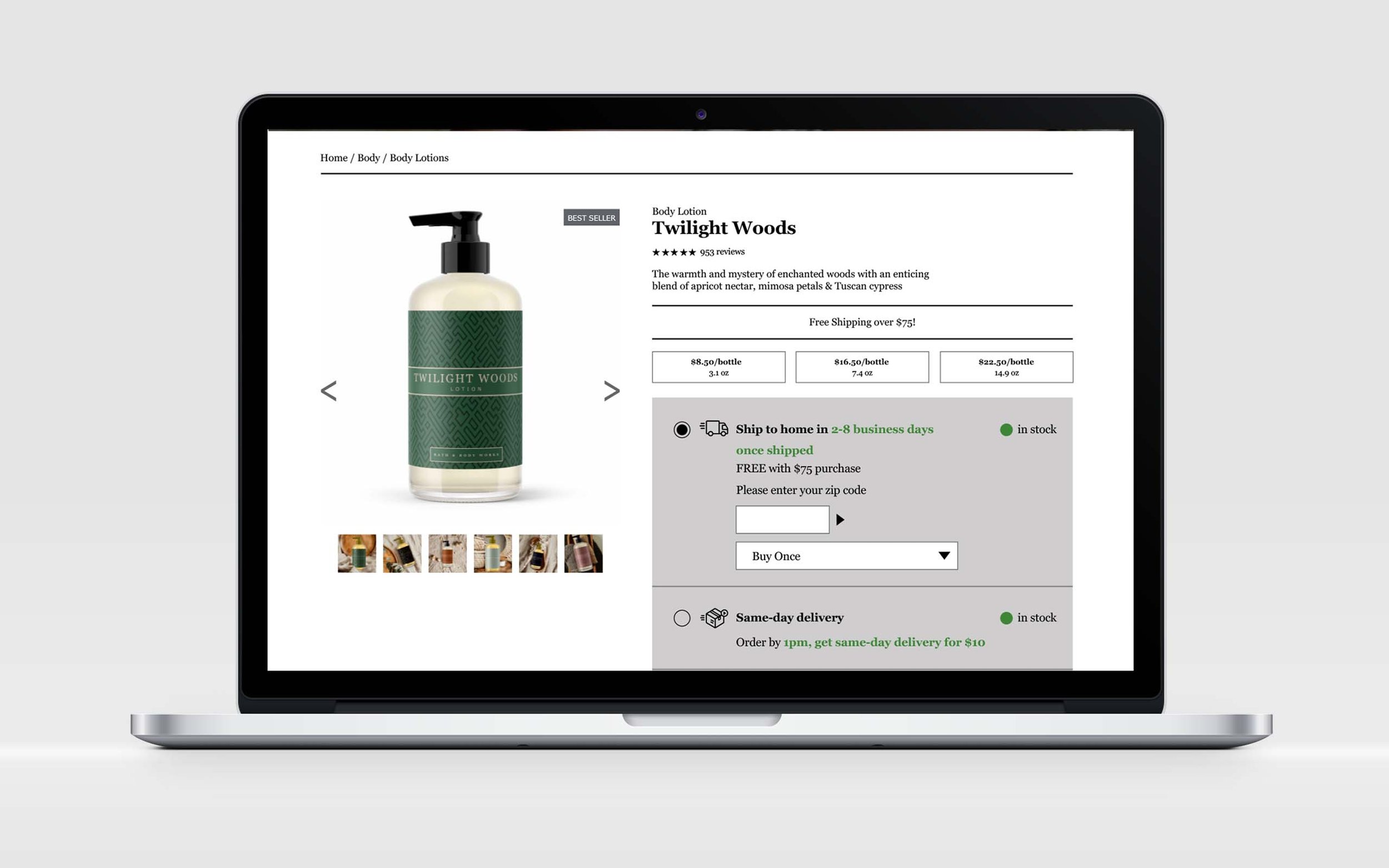

Research shows that a well-crafted color palette can enhance brand recognition by up to 80%, so I strategically selected a warm palette for Bath & Body Works, incorporating greens, oranges, blues, and pinks to evoke specific emotions. Green was used to represent health, orange to convey warmth, blue to instill trust, and pink to add playfulness, aligning with the desired consumer experience of luxury and comfort. Additionally, geometric patterns were integrated into the packaging design to capture attention and communicate modernity, while offering a sense of order and stability. To enhance the perceived product quality and appeal, clear bottles with elegant pumps were chosen, making the products visually appealing and helping to drive sales.
