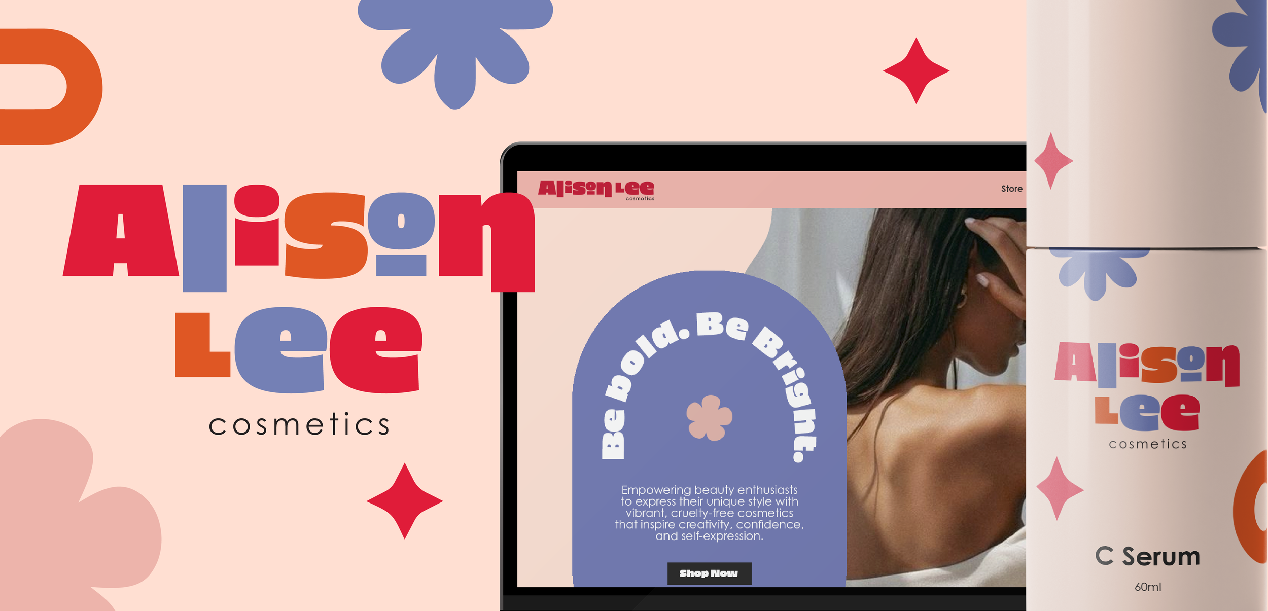
aLison Lee cosmetics
With 62% of consumers viewing beauty products as a tool for self-expression and the cruelty-free cosmetics market projected to reach $23.54 billion by 2030, it was essential for Alison Lee Cosmetics to stand out as a brand that champions both individuality and ethical beauty. To meet this demand, I led the development of a bold, purpose-driven brand identity that not only celebrated self-expression through vibrant, cruelty-free products but also aligned with the growing consumer desire for ethical choices. Through strategic design elements, messaging, and storytelling, I crafted an experience that empowered consumers to embrace their creativity, confidence, and authenticity, while remaining mindful of their values.
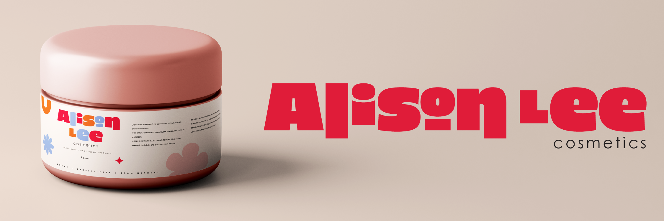
With 80% of Millennials and Gen Z preferring cruelty-free and eco-friendly products, it was crucial for Alison Lee Cosmetics to reflect these values in its brand identity. Understanding that these generations prioritize sustainability and ethical practices, we positioned the brand as a champion of both beauty and environmental responsibility. From the packaging design to the messaging, every element emphasized the brand's commitment to cruelty-free practices and eco-conscious materials, ensuring that Alison Lee Cosmetics resonated with consumers who care deeply about the planet and its inhabitants.
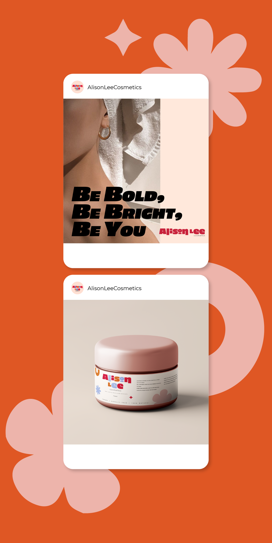
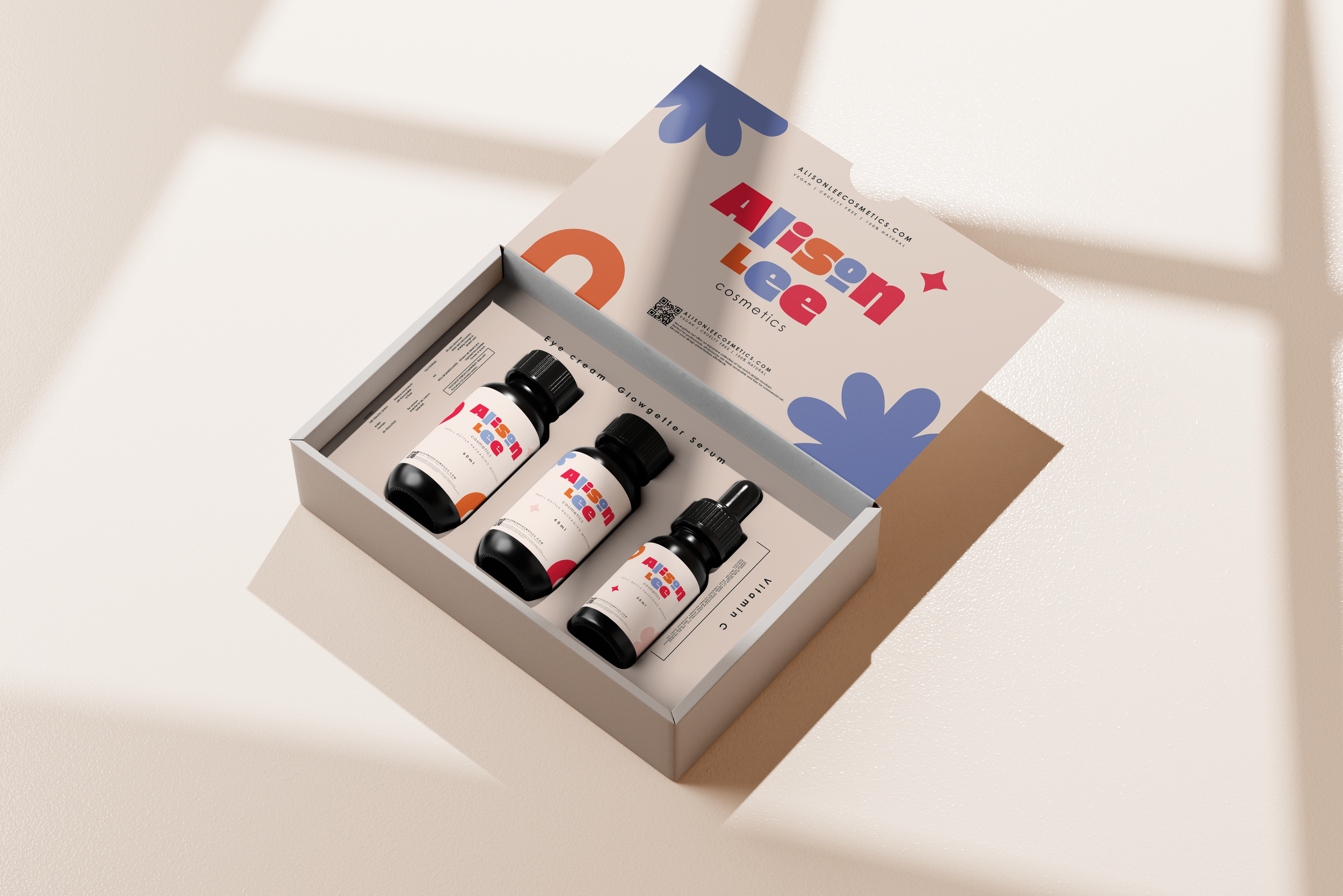

Market research shows that color choices significantly influence consumer perceptions and behaviors, with 90% of customers making product decisions based on color alone. For Alison Lee Cosmetics, this insight was key in shaping the visual identity. I carefully selected a color palette that not only captured the brand’s modern, luxurious feel but also resonated with the emotional connection consumers have with beauty products. The brand colors were strategically chosen to evoke trust, confidence, and excitement, ensuring that each product stood out on the shelf and aligned with the brand’s core values of elegance and sophistication.
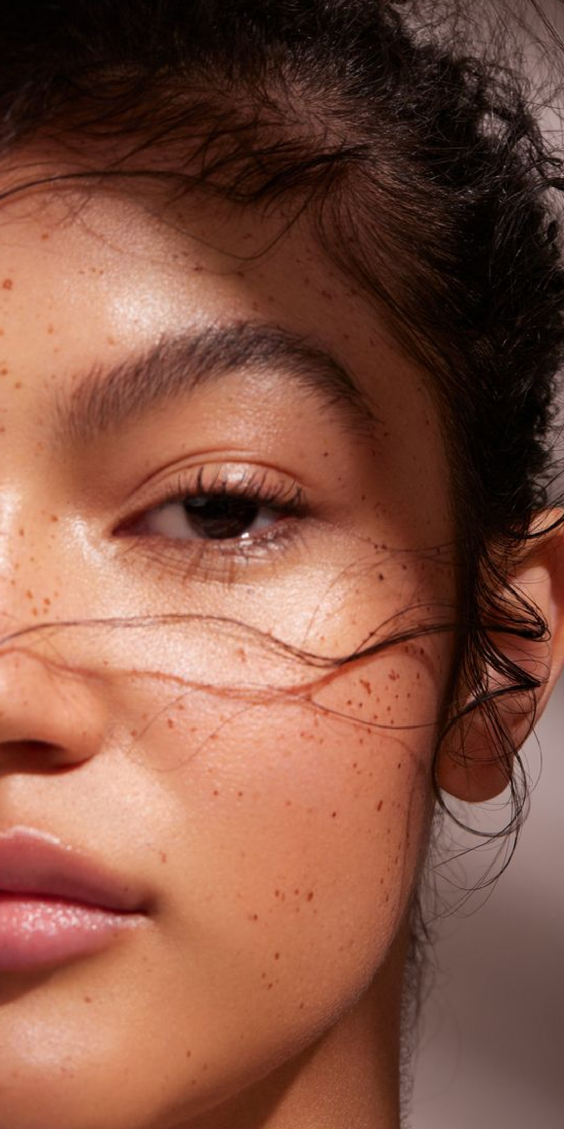

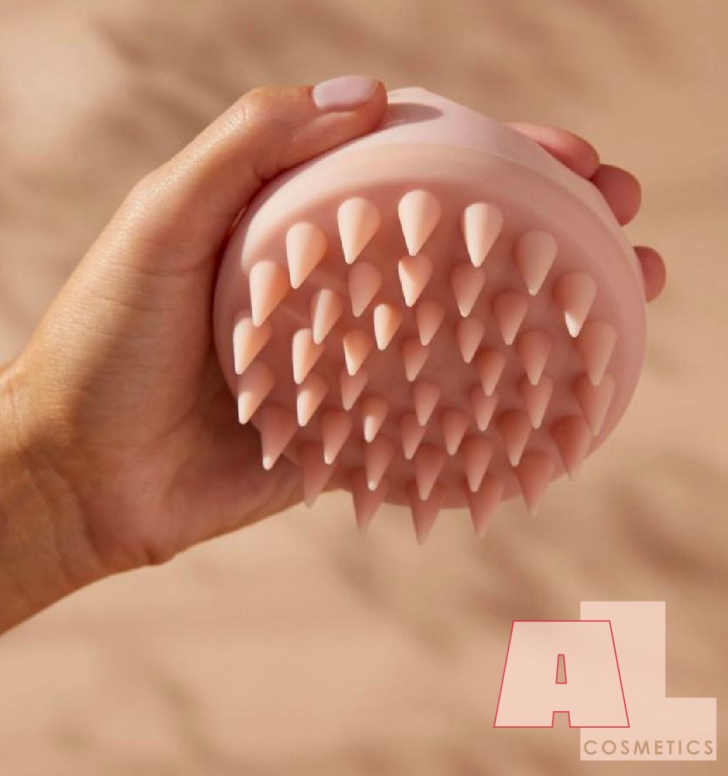
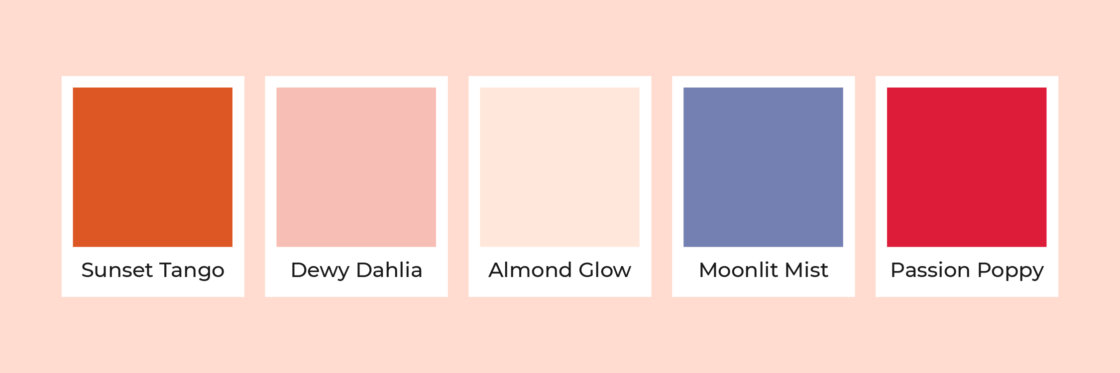
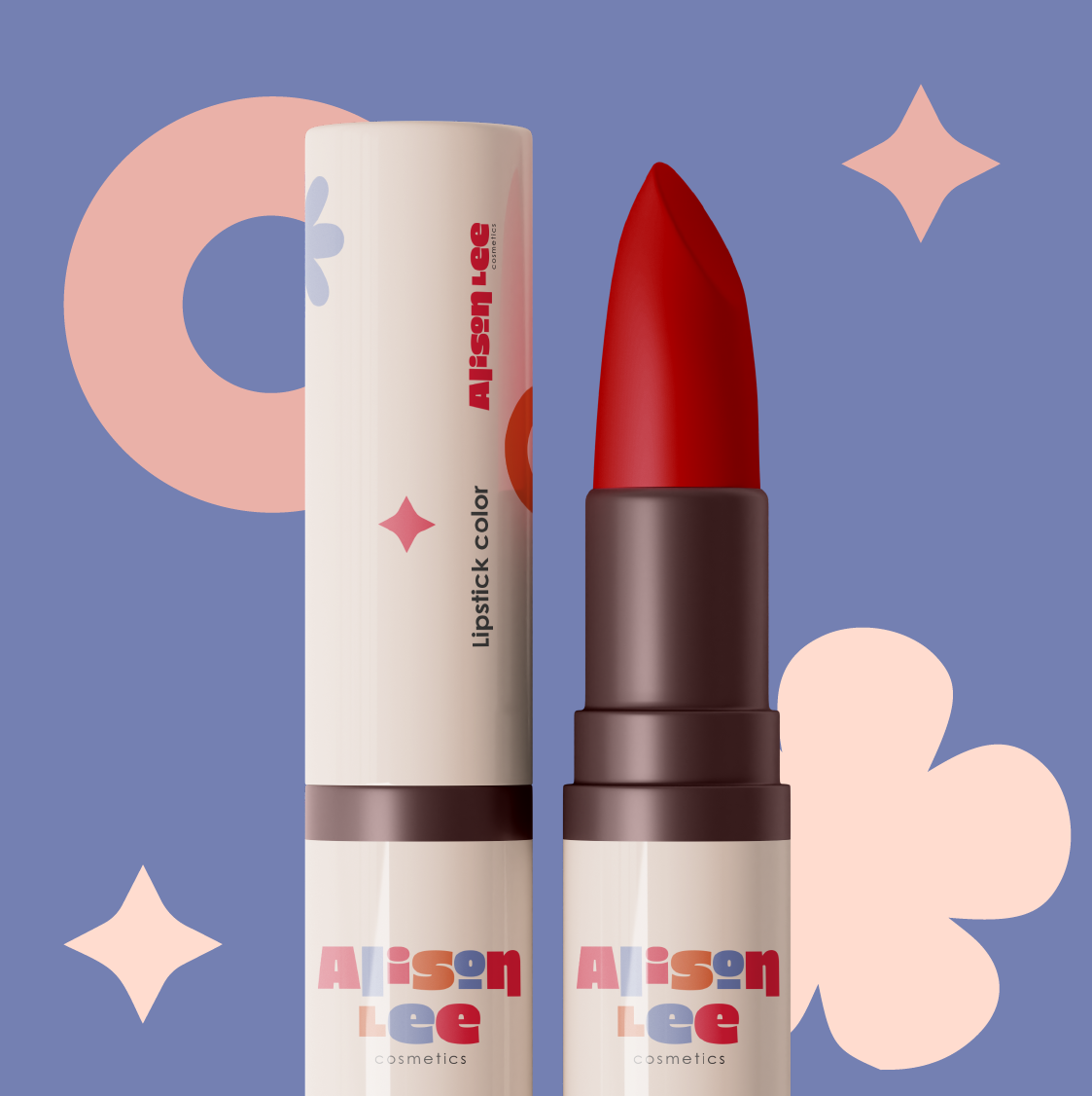
Incorporating neutral colors like beige, taupe, and soft grey for the skincare packaging was a strategic choice to evoke timeless sophistication and versatility. These colors create a clean, minimalist look that exudes elegance. To balance this with energy and warmth, I introduced shades of orange, known to evoke excitement and enthusiasm, making the brand feel both inviting and lively. By integrating these neutral tones with vibrant oranges and soft pinks, the rebrand strategically merged sophistication with vibrancy, appealing to consumers seeking products that are both elegant and energizing. This thoughtful color palette was crafted to attract and engage a modern audience looking for a harmonious blend of luxury and vitality.
